Make up 4 jasper's film research
For this project, i was originally intending to do a few designs and go from there, however i fell into another research pit and became really interesting in makeup and how it reacts on screen and on stage and also into the importance of colour. I know this is a film, however from reading the script and looking at the visuals, it seems very theatrical.
VELVET GOLDMINE:


MAKE UP MOODBOARDS:


https://en.wikipedia.org/wiki/Wassily_Kandinsky
"This inner necessity is the right of the artist to unlimited freedom, but this freedom becomes licence if it is not founded on such a necessity. Art is born from the inner necessity of the artist in an enigmatic, mystical way through which it acquires an autonomous life; it becomes an independent subject, animated by a spiritual breath.
The obvious properties we can see when we look at an isolated colour and let it act alone, on one side is the warmth or coldness of the colour tone, and on the other side is the clarity or obscurity of that tone. Warmth is a tendency towards yellow, and coldness a tendency towards blue; yellow and blue form the first great, dynamic contrast. Yellow has an eccentric movement and blue a concentric movement; a yellow surface seems to move closer to us, while a blue surface seems to move away. Yellow is a typically terrestrial colour, whose violence can be painful and aggressive. Blue is a celestial colour, evoking a deep calm. The combination of blue and yellow yields total immobility and calm, which is green."
'Clarity is a tendency towards white, and obscurity is a tendency towards black. White and black form the second great contrast, which is static. White is a deep, absolute silence, full of possibility. Black is nothingness without possibility, an eternal silence without hope, and corresponds with death. Any other colour resonates strongly on its neighbors. The mixing of white with black leads to gray, which possesses no active force and whose tonality is near that of green. Gray corresponds to immobility without hope; it tends to despair when it becomes dark, regaining little hope when it lightens.
Red is a warm colour, lively and agitated; it is forceful, a movement in itself. Mixed with black it becomes brown, a hard colour. Mixed with yellow, it gains in warmth and becomes orange, which imparts an irradiating movement on its surroundings. When red is mixed with blue it moves away from man to become purple, which is a cool red. Red and green form the third great contrast, and orange and purple the fourth.'
I know mainly the makeup is going to be inspired by 80s era kind of thing, however there are a lot of other sources that i think are really useful, even though i most likely wont use them as the main focus of inspiration.
theatre makeup, masks?, mime ? victorian stuff? marie antoinette, orlando, white face, blushhhh,


https://en.wikipedia.org/wiki/Theatrical_makeup
'Performers who portrayed God painted their faces white or gold; actors playing angels painted their faces red'


HEROIN CHIC - not the first time that signs have sickness were glamorised.

Tuberculosis Chic was also a thing, and now the e-girl makeup uses blush to create kind of a similar 'sick' or 'ill' effect.
https://hyperallergic.com/415421/consumptive-chic-a-history-of-beaty-fashion-disease/
https://www.smithsonianmag.com/science-nature/how-tuberculosis-shaped-victorian-fashion-180959029/

VELVET GOLDMINE:
MAKE UP MOODBOARDS:


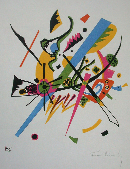
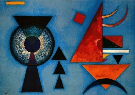
KANDINSKY:

https://en.wikipedia.org/wiki/Wassily_Kandinsky
"This inner necessity is the right of the artist to unlimited freedom, but this freedom becomes licence if it is not founded on such a necessity. Art is born from the inner necessity of the artist in an enigmatic, mystical way through which it acquires an autonomous life; it becomes an independent subject, animated by a spiritual breath.
The obvious properties we can see when we look at an isolated colour and let it act alone, on one side is the warmth or coldness of the colour tone, and on the other side is the clarity or obscurity of that tone. Warmth is a tendency towards yellow, and coldness a tendency towards blue; yellow and blue form the first great, dynamic contrast. Yellow has an eccentric movement and blue a concentric movement; a yellow surface seems to move closer to us, while a blue surface seems to move away. Yellow is a typically terrestrial colour, whose violence can be painful and aggressive. Blue is a celestial colour, evoking a deep calm. The combination of blue and yellow yields total immobility and calm, which is green."
'Clarity is a tendency towards white, and obscurity is a tendency towards black. White and black form the second great contrast, which is static. White is a deep, absolute silence, full of possibility. Black is nothingness without possibility, an eternal silence without hope, and corresponds with death. Any other colour resonates strongly on its neighbors. The mixing of white with black leads to gray, which possesses no active force and whose tonality is near that of green. Gray corresponds to immobility without hope; it tends to despair when it becomes dark, regaining little hope when it lightens.
Red is a warm colour, lively and agitated; it is forceful, a movement in itself. Mixed with black it becomes brown, a hard colour. Mixed with yellow, it gains in warmth and becomes orange, which imparts an irradiating movement on its surroundings. When red is mixed with blue it moves away from man to become purple, which is a cool red. Red and green form the third great contrast, and orange and purple the fourth.'
I know mainly the makeup is going to be inspired by 80s era kind of thing, however there are a lot of other sources that i think are really useful, even though i most likely wont use them as the main focus of inspiration.
theatre makeup, masks?, mime ? victorian stuff? marie antoinette, orlando, white face, blushhhh,
ART DECO:
https://en.wikipedia.org/wiki/Theatrical_makeup
'Performers who portrayed God painted their faces white or gold; actors playing angels painted their faces red'
commedia dell'arte
'One Leone di Sommi, writing in the second half of the 16th century, stated he didn't take much care as to the actual appearances of his actors, "for there art can supply nature, either by dyeing a beard or painting a scar, making a face pallid or yellow, or healthier and ruddy, or whiter or browner, etc., as may be necessary. But I never in any circumstances use masks or false beards, because they too much impede utterance; if I were forced to give an old man's part to a beardless actor, I would paint his chin so that it looks shaved and add to the white wig under his cap a few locks hanging over his cheeks and forehead..." In fact, he later indicates he actually preferred his actors to be unrecognizable from their regular selves, so that the illusion of the show wouldn't be spoiled.'
HEROIN CHIC - not the first time that signs have sickness were glamorised.

Tuberculosis Chic was also a thing, and now the e-girl makeup uses blush to create kind of a similar 'sick' or 'ill' effect.
https://hyperallergic.com/415421/consumptive-chic-a-history-of-beaty-fashion-disease/
https://www.smithsonianmag.com/science-nature/how-tuberculosis-shaped-victorian-fashion-180959029/

At a point where im trying to mix a more abstract and blended type with the sharp cubist kandinsky kinda thing. Will do some drawings of ideas and go from there.
Lighting research for makeup bc how colour interacts with the colours on the face is important, as some colours wont show under red lighting for example and this could be also played with to disappear in some shots and be seen in others etc.
Wonderful stuff, thanks!
ReplyDelete