Research on Colour Psychology | 13.11.17
As a part of research for our documentary, I decided to do some research on colour psychology in the library and this is what I found out of two useful books.
“The special and aerial qualities that the light blues and
Cyan generate are also colours identified as being associated with a release of
tensions and a spirit getting away from things that constrict and the
experience of freedom and open-mindedness.”
Adding a touch of red to blue can solidify it and it ‘stands
up for itself’ rather than being far away and spacious.
Colour Tree:
The peak impact of light and colour is likely to present a zone of effects from very likely to those of real pain and shock. At Moderate Impact, the colours are more like a natural environment. Colours that have austerity and stability and not intrusive.
The peak impact of light and colour is likely to present a zone of effects from very likely to those of real pain and shock. At Moderate Impact, the colours are more like a natural environment. Colours that have austerity and stability and not intrusive.
COLOUR SYMBOLISM FROM PREHISTORY TO MODERN AESTHETICS,
PSYCHOLOGY, & IT, Don Pavey, 701.85PAV
Blue is seen as reliable and trustworthy. Periwinkles are
the warmest and most playful as they carry an undertone of purple – energy of
purple.
Green goes with blue and creates ‘motherly’ colours and
always get pleasant responses. They can be cool, however theres an element of
warmth as theres the relation to warmer, tropical waters.Mainly green is
associated to nature. Deep greens relate to tall pines, linking to the silence
of the forest.
Purple is a luxurious and elegant colour. A deep royal
purple is seen as regal and majestic. A
purple with pink adds a sentimental and more nostalgic tone.
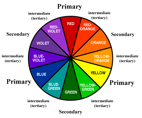
ANALOGOUS COLOURS – neighbouring families on the colour
wheel. Unless the selection of colours goes more than a fourth of the wheel,
they are always harmonious as they share the same undertones. Eg: blue,
blue-green, and green. Total harmony isn’t always the aim as it may make less
of an impact and blend together more. Expanding the selection adds touches to
the neighbouring colour and will grab slightly more attention. Eg: gree, blue-green,
blue, blue-purple.
COMPLEMENTARY COLOURS – total opposites on the colour wheel
and enhance each other. The red will appear redder when paired with green as
will orange with blue or yellow with purple. They balance each other; one hue
is warm, one cool.
Blue Purple: Meditative, spiritual, futuristic,
Lavendar: sweet, delicate, floral
Light Blue: calm, quiet, peaceful
Navy: classic, serene, quiet
light green: calm, quiet, soothing, neutral
dark green: nature, trustworthy, restful,
Lavendar: sweet, delicate, floral
Light Blue: calm, quiet, peaceful
Navy: classic, serene, quiet
light green: calm, quiet, soothing, neutral
dark green: nature, trustworthy, restful,
PANTONE GUIDE TO COMMUNICATING WITH COLOR BY LEATRICE
EISEMAN 701.85 EIS
For our mindfulness event, we are more likely to use Analogous colours like blue to green and also stretch to purple. This is because we all decided that these colours would create the most calming and ethereal experience as we also hope to make connotations to nature and maybe use imagery of nature to take the partakers to another calm place. The blue will add enlightenment and create a free and spacious atmosphere, and by adding elements of purple it will help ground it slightly and not have everything blend it; it would create a nice contrast but not a harsh or abrupt contrast.
Comments
Post a Comment